Sunday, July 1, 2012

Uffizi ceiling grotesques

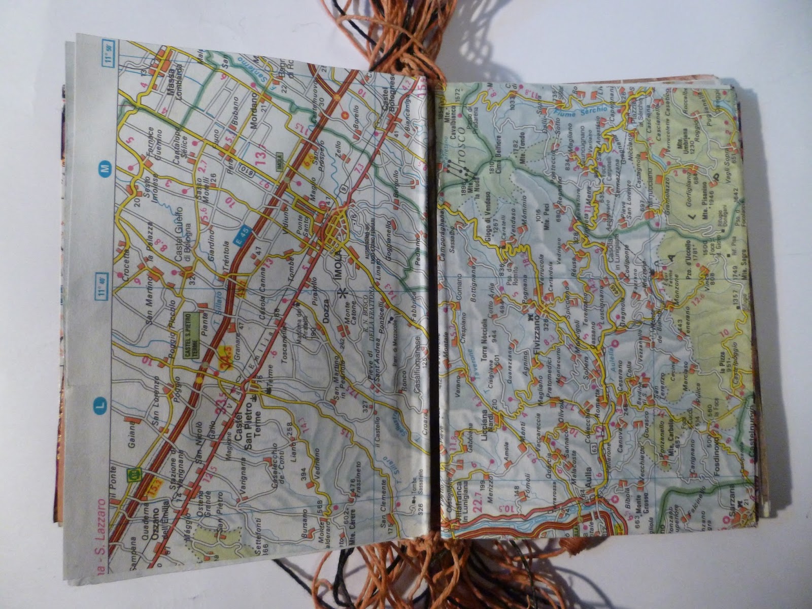
This book is made from postcards bought at the uffizi museum in florence, of the ceiling grotesques. plus some ephemera and pieces of coloured paper which worked with the colours.
each card is folded over waxed string, and then each string is tied to the string from the next card.
Because of the way I tied them, the book wanted to sit on a slope, so I made a slipcase with a sloping inside base. 
The beads on the ends of the strings are hand made from paper and double-sided tape.
This work was made at the Sturt Winter School in 2012, in a Caren Florance class (booking your travel).  


Monday, February 6, 2012

Roof Book-derived concertinas

Once I altered this book I wanted to make it again but more easily.
I photographed it and straightened all the images on photoshop.
My biggest issue with the altered book was how cleanly the cuts were (not) made. I thought by printing on lighter paper it would be easier.
I discovered my accuracy isn't that great no matter what. but this worked out quite nicely.
The front is the other book printed on a crappy Brother laser printer (so it's all pastel, not the bright primaries of the original) 
Backed with some Oscar Wilde Plays.
cut out a few  bits to have the light come through. 

measures about 7 x 15cm.


this is a similar book, just from a limited colour range (these were red in the original!). I got more ambitious with the cut outs, just to see how far I could push it. 
the answer is quite far!


That's one of my french street pieces in the background.


Friday, January 20, 2012

Colour workshop

This one came from a colour workshop I did with Adrienne Crouch in 2012 (I think). This canvas caught the drips from other works i was doing on the easel, and then the kimono-clad woman just emerged from the shadows of the trees with her picnic blanket. I believe it's better to let the painting do all the work for me, so I just tidied it up a little, and here it is.


These are the works from which the drips came.

the exercise we were given was to copy the composition and colours (although after a while it's pretty much the work's responsibility to tell you what to do with it).
These photos are a little shiny, sorry about that!
Of course I was copying Fred Williams


The piece below was also in the same series (same colours!).
it's supposed to be portrait
it has a lot of splashes and drips (because i used a few layers of glazes on the other pictures). and there are some words in there too (this one is Bellbirds by Henry Kendall)